1Overview
The Project
Academic project for BrainStation's UX Design Diploma program. The problem space is concerning travelers with severe food allergies. These individuals face fear and anxiety when traveling abroad due to uncertainties regarding the local cuisine as it relates to their allergies.
This solution allows travelers with food allergies to travel abroad, experience new cultures, and navigate around local cuisines. This is an individual case study spanning the design process from problem discovery, definition, developing, and design iteration.
My Roles
UX Researcher
UX/UI Designer
Tools
Figma
Figjam
InVision
Outcomes
96% task completion rate in user testing
100% of testers would use this solution
Design Methodology

The methodolgy used to complete this project was the double diamond design process. This process helped to guide me in discovering the true problem and defining, designing, and iterating a solution for that problem.
2The Problem
People with food allergies, who represent up to 10.8% of the global population, have the problem that they experience fear and anxiety when traveling abroad because they may be put in a life-or-death situation when eating the local cuisine. Uncertainties about the ingredients in dishes and language barriers with food handlers contribute to these travelers’ fear and anxiety.
According to a survey posted to the Global Journal of Allergy →:
8%
of people with food allergies do not travel at all due to their food allergies.
46%
of people with food allergies experience fear when traveling abroad.
49%
of people with food allergies experience anxiety when traveling abroad.
3The Solution
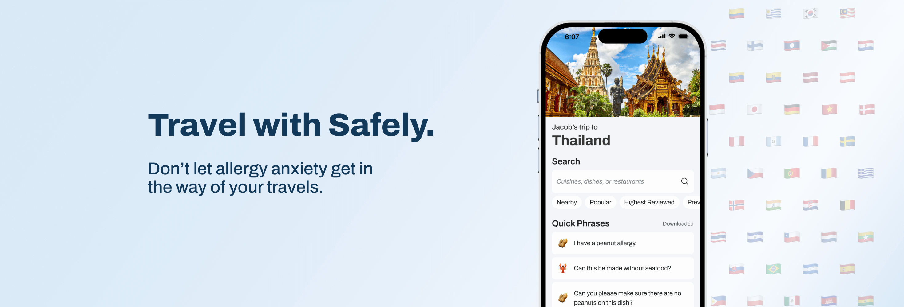
Helping travelers with food allergies to find safe restaurants and communicate their allergies
This solution is the result of multiple rounds of usability testing and iteration. It aims to help travelers with food allergies find restaurants that are safe to eat at, provide directions to those restaurants, and then translate their allergies to the waitstaff.
4Primary Research
Guiding my Research
I assumed that the local language barrier was the greatest contributor to the fear and anxiety of travelers and so I crafted the following hypothesis to guide my research:
I believe language barriers create skepticism or doubts in people with severe food allergies that prevent them from trusting the local cuisine while abroad.
I will know this to be true when the majority of my interview respondents acknowledge that language barriers have been a factor that have caused hesitation in choosing a travel destination.
Forming Assumptions
1
People have a need to know the food ingredients of dishes when traveling abroad to ensure they are eating safe food.
2
These needs can be solved with trip preparation and education, and simple ways to communicate abroad.
3
My initial users will be people who have food allergies who have expressed an interest to travel but have fears or anxieties to travel.
4
The #1 value a user wants to get from my solution is being able to navigate the local cuisine safely while abroad.
User Research
For primary research, my research method was user interviews. I was able to interview three participants all of whom met my participant criteria:
Participants have a food allergy.
Participants have had an allergic reaction in the past.
Participants expressed a desire to travel.
⚠️
Due to time constraints, I was limited in the demographic of respondents available to me. Although each participant met the above criteria, the three participants I interviewed were similar in demographics and even allergies. I would have liked the opportunity to interview more diverse respondents to allow for a wider variety of experiences and insights.
What Interviewees are Saying
"I don't want to travel somewhere with my friends and feel like I'm weighing them down - I don't want to be a burden on the trip"
"If I'm traveling with friends, I don't want to hold back the group in choosing restaurants"
"I still want to experience local culture, I would try to find restaurants that can communicate well"
"I would prepare by trying to learn a bit of the language to at least let them know my allergies"
"I would prepare by looking up translations of food allergies"
Key Insights Gained from User Interviews
Allergies in social settings
People with food allergies are hesitant and cautious when faced with social situations that could potentially involve their allergies. Because of the severity of their food allergies, respondents take great care in researching new dishes or restaurants and want to know what ingredients go into a dish.
Trip experience
People with food allergies don’t want to be a burden to those they are traveling with. They hesitate about eating the local cuisine due to communication issues.
Trip preparation & planning
While understanding limitations due to their allergies, people with food allergies have expressed a desire to travel to foreign countries. Confidence can be created with preparation - epipens, medicine, efforts to communicate over a language barrier, and more stringent restaurant selection.
Creating a Persona to Summarize Research
Jacob
Goals
Confidence that the food he eats will not contain anything he is allergic to
Find restaurants that he can trust to eat at
Pain Points
Feels anxious when he doesn’t know what ingredients are in a dish
Hesitates to ask about his allergies because of language barriers
Jacob is interested in traveling to Thailand, but because of his food allergies he is hesitant to travel. He doesn’t want to be anxious at every meal or be an inconvenience to his friends.
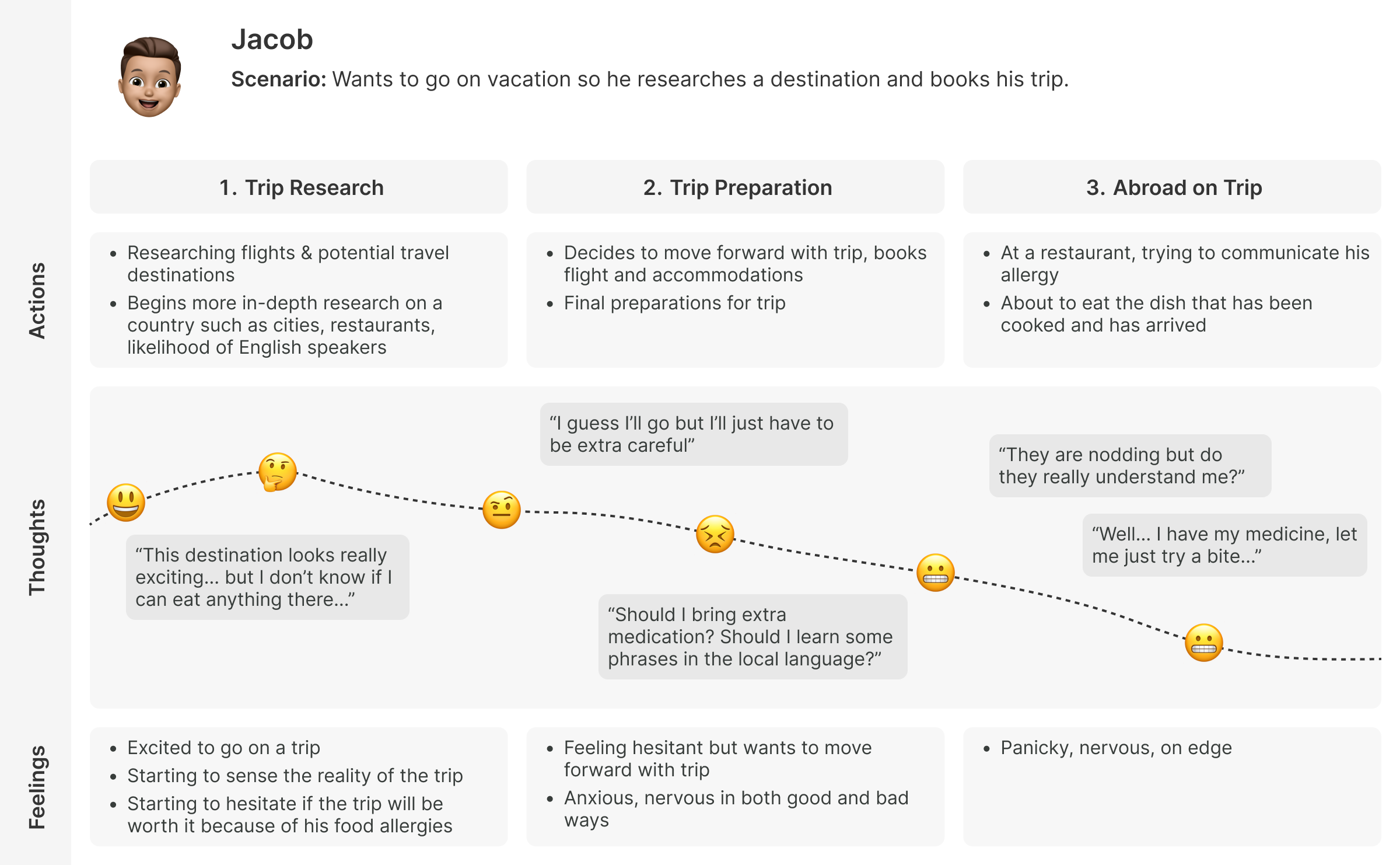
Mapping the Current Experience
I mapped out the current experience of my persona to have a better understanding of potential opportunities for design intervention.
How Might We Solve for this Problem?
How might we help people with food allergies who are traveling so that they won’t eat any food that contains their allergies?
5Ideation
Brainstorming Potential Solutions
With key opportunities identified in my experience map, I authored user stories to outline the features and functionality of a potential solution. I categorized my user stories into four epics based on:
Dining abroad
Epipens
Social features
Travel preparation
While each epic would contribute to building a feature-rich solution, I decided the dining abroad epic is the most robust and would best serve to create an MVP solution.
Chosen Epic: Dining Abroad
User Story
As a traveler
I want to find restaurants near me
So that I have a place to eat that’s easy to get to
User Story
As a traveler
I want to translate my food allergies
So that I can easily tell waitstaff about my allergies
User Story
As a traveler
I want to view if restaurants are trusted
So that I know instantly that it’s safe to eat there
I believe actively helping travelers while they are abroad to navigate around their food allergies is the goal of any proposed solution for this problem space and would provide the most value.
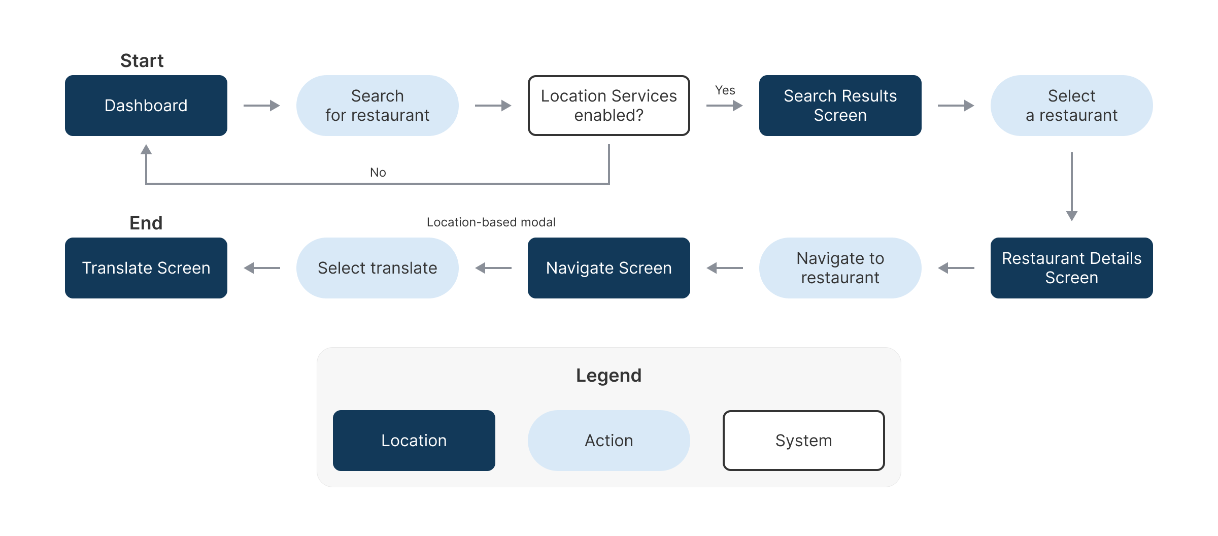
Task Flow
My proposed solution would allow users to find restaurants, navigate to them, and translate their allergies to waitstaff.
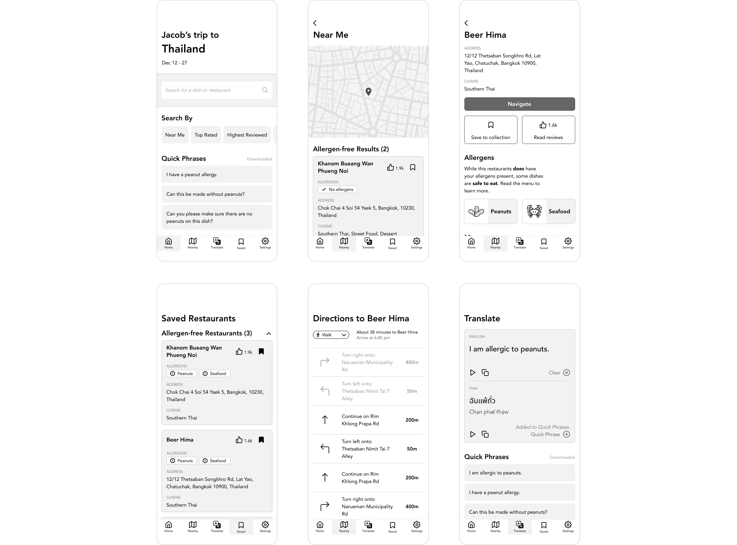
Sketching into Mid-fidelity Wireframes
I began to sketch what screens would look like and the information they would be required to convey. These wireframes were used for the first round of user testing to gain feedback before committing to the design for a high-fidelity prototype.
My Design Decisions
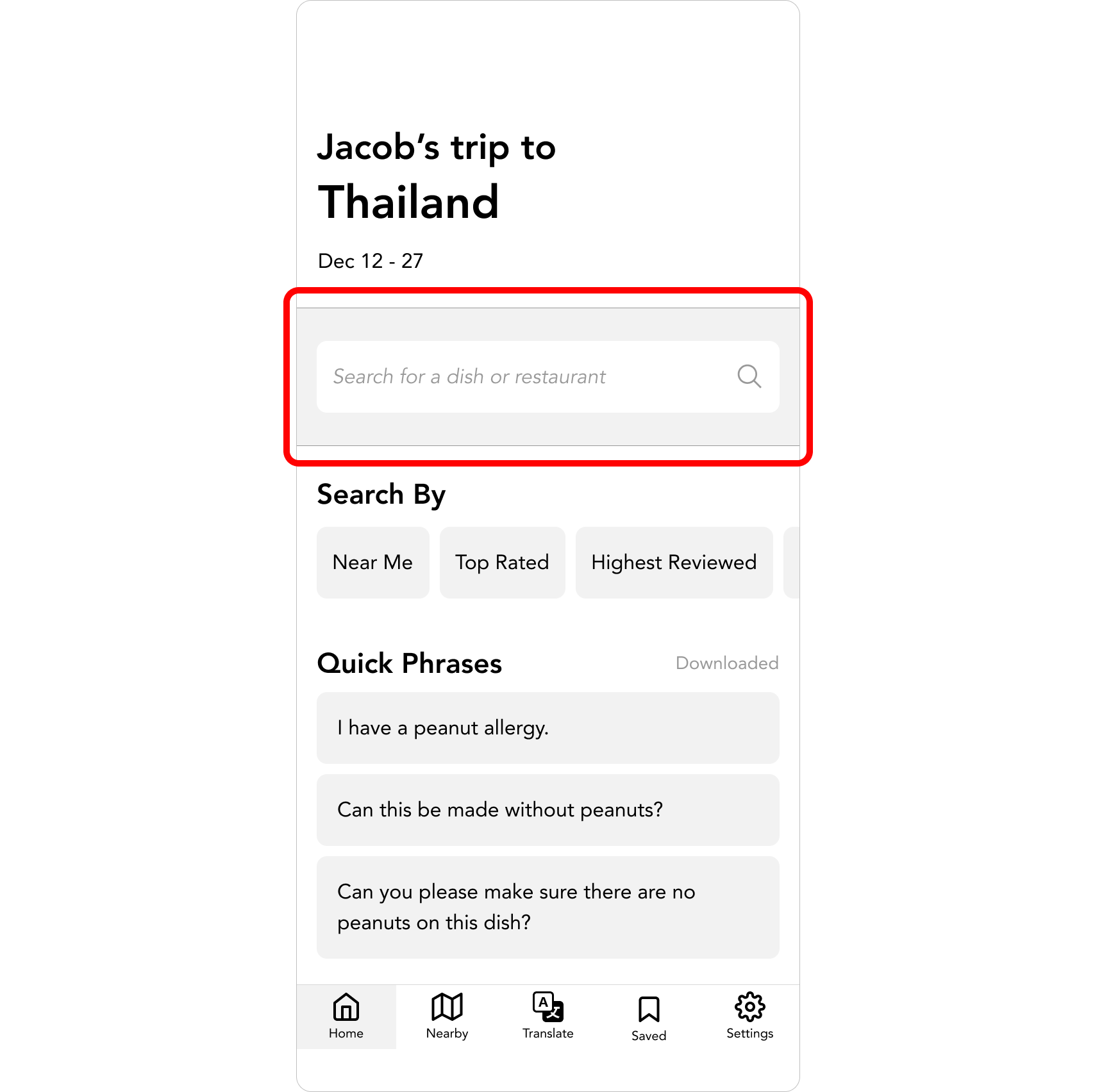
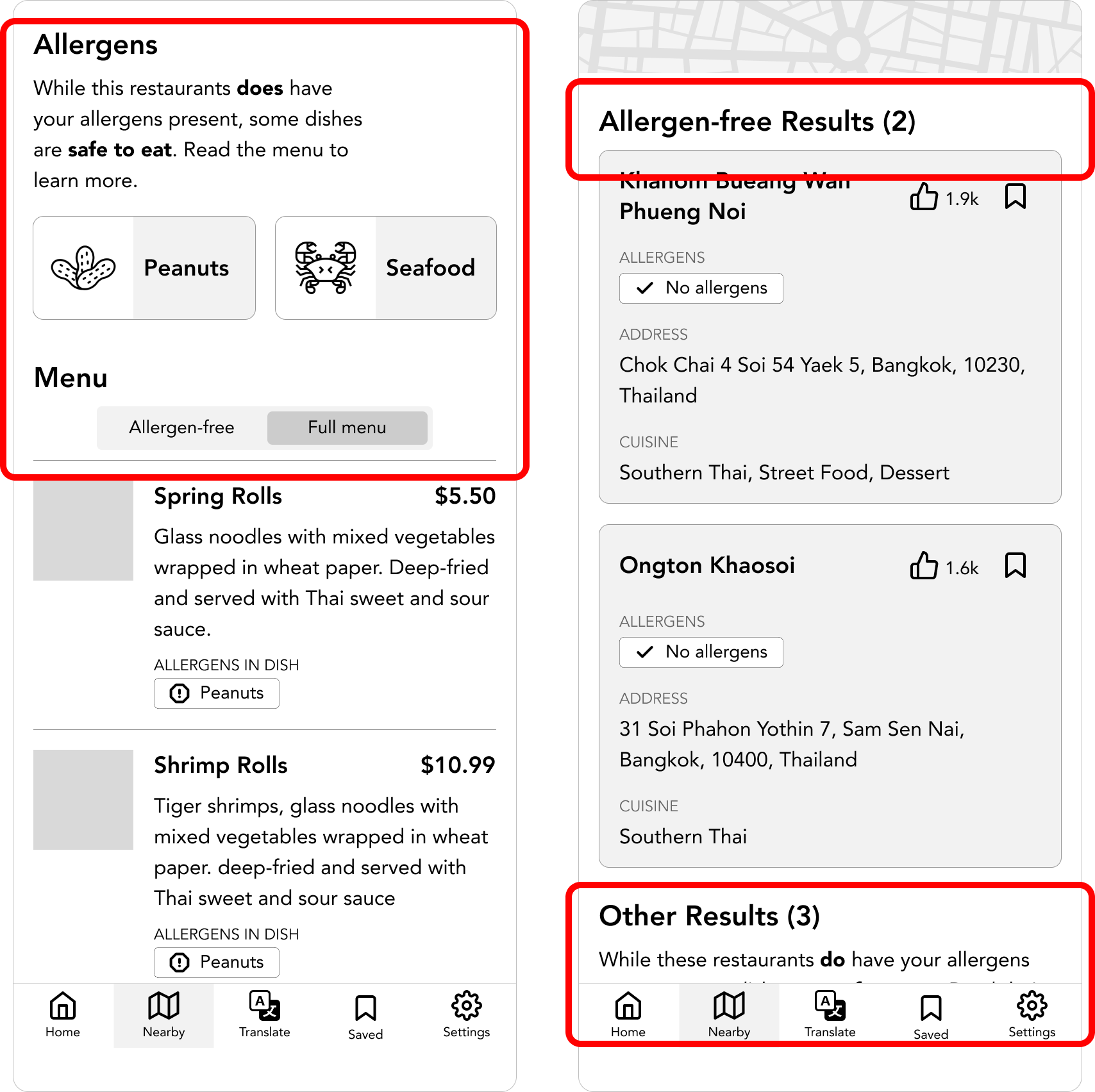
Emphasis on search and discoverability
I wanted the search feature to be highly visible and accessible. It is on the dashboard to emphasize how important searching for restaurants is in my app.
Visibility of allergens and prioritization of safe options
A user can easily see what allergens may be present at a restaurant. Restaurant search results are sorted by allergen-free options, and then other restaurants where some dishes will include a user’s allergens.
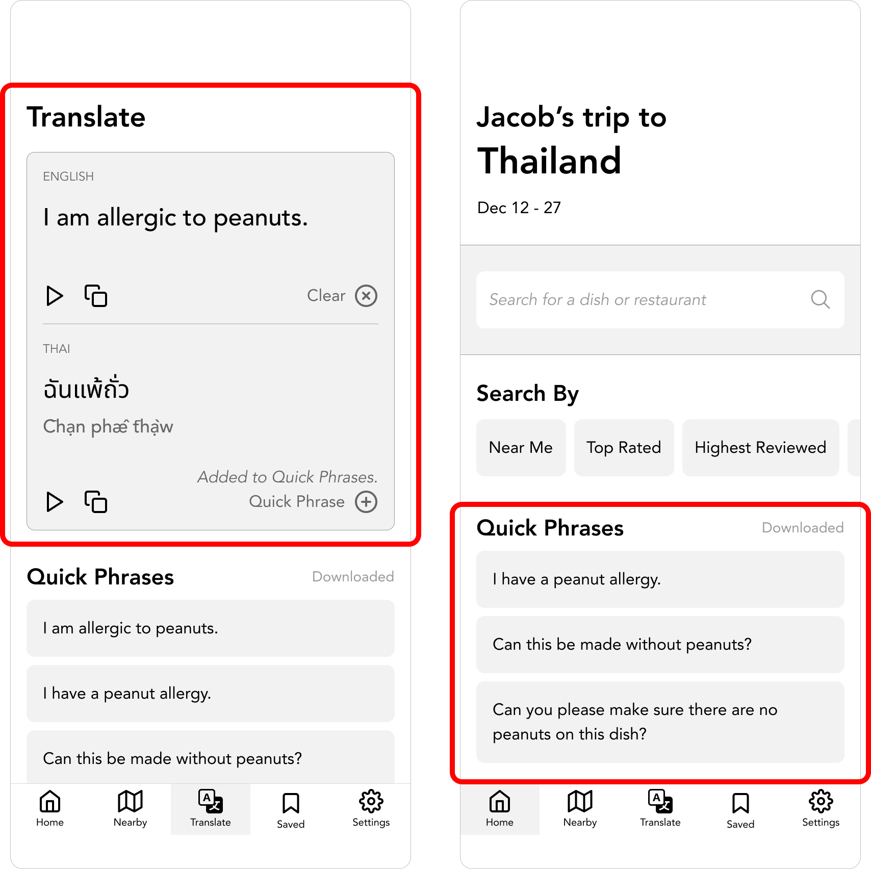
Translating allergies to communicate effectively
When a user wants to translate their allergies, they can do so by either typing in what they would like to translate or take advantage of pre-populated Quick Phrases. Quick Phrases are also found on the home screen for convenient access for the user.
Let’s Test my Solution against Real People
With my initial design complete, I performed usability testing with five testers.
👍
Highlights
Testers found the most value in the Translation page, specifically the manual translate and Quick Phrases
Testers appreciated the distinction between allergen-free options and all options, for both restaurants and their menus
🛠️
Room for Improvement
The 'Begin Translation' CTA was consistently confusing
The Directions page felt incomplete
Testers could not visualize the expected outcome of interacting with Quick Cards
V2 Iteration, Let’s Try Again
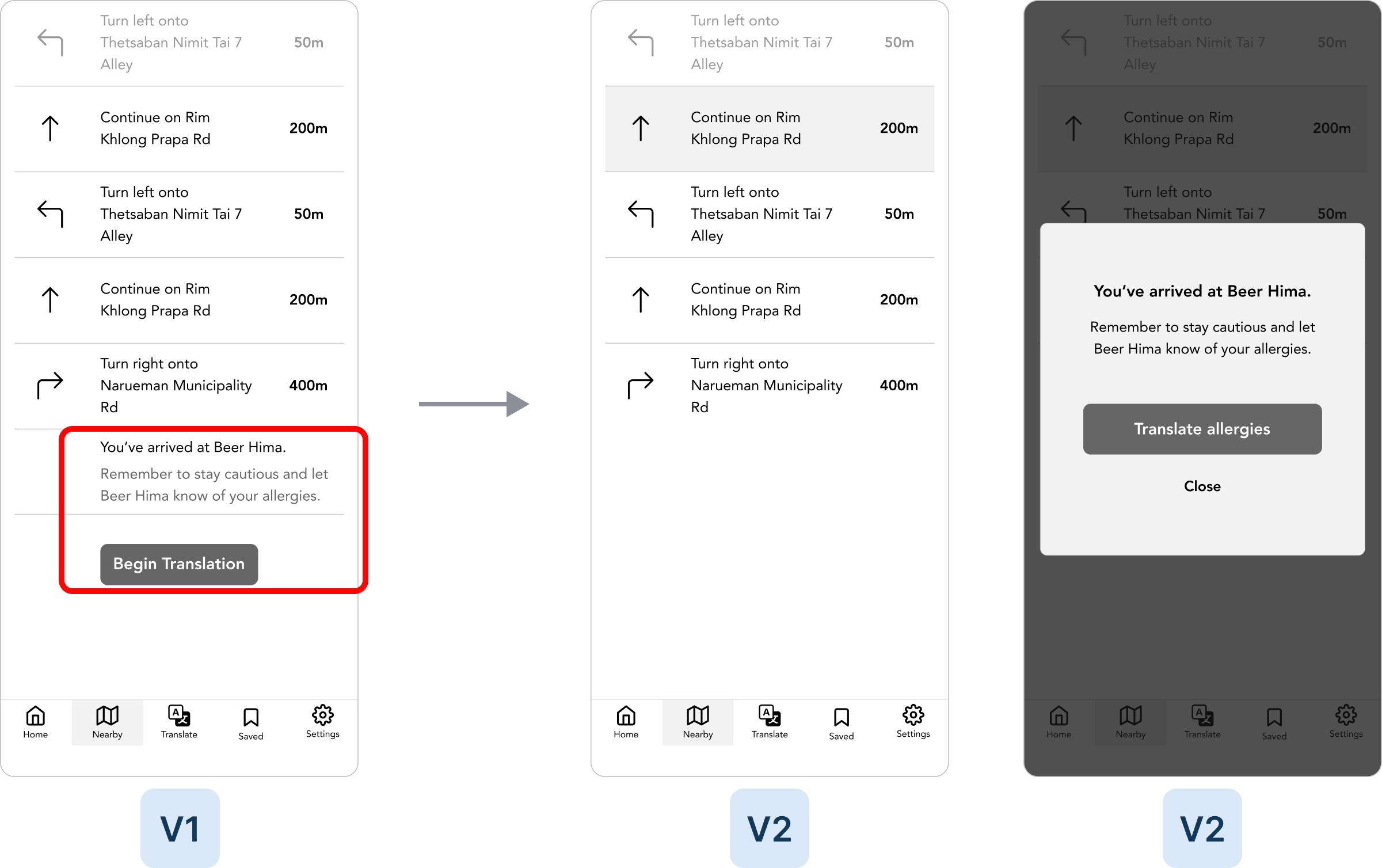
The most consistent feedback received during round 1 of user testing was that this 'Begin Translation' CTA was confusing. The context could not be interpreted from the other elements on the page. I updated this CTA to become a location-based modal that would appear when the user has arrived at their destination. I also updated the copy to more clearly communicate to the user the intent of the CTA.
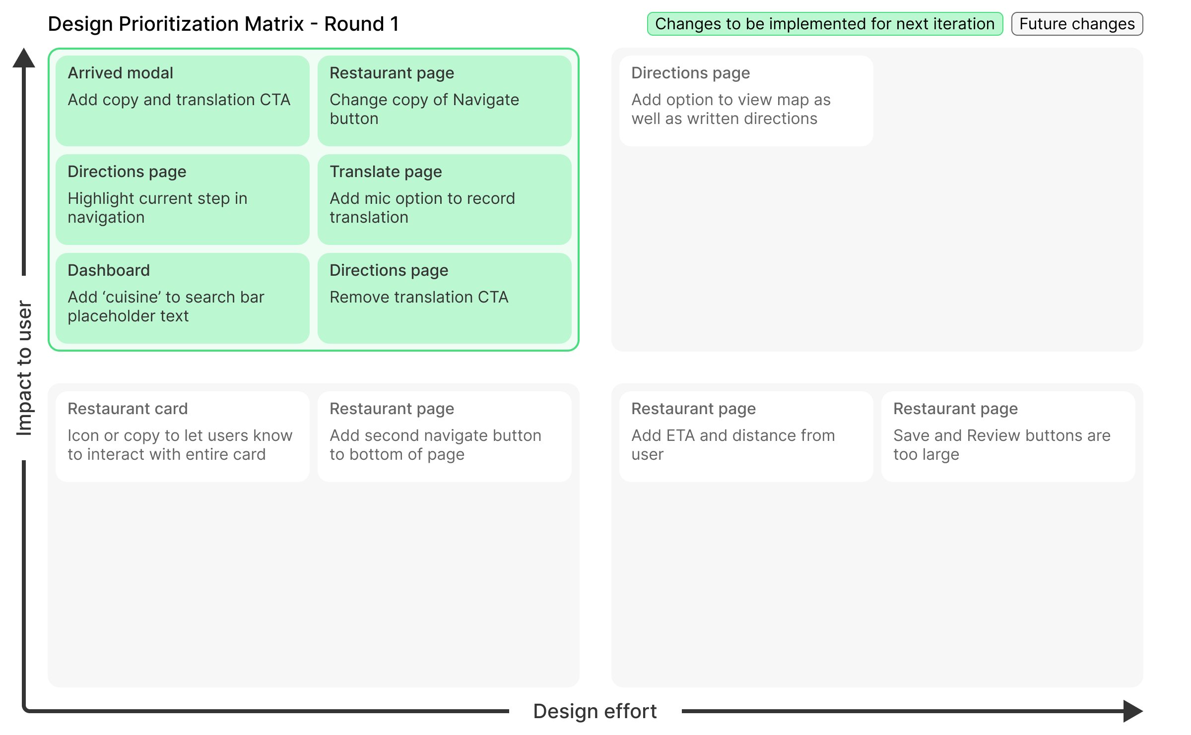
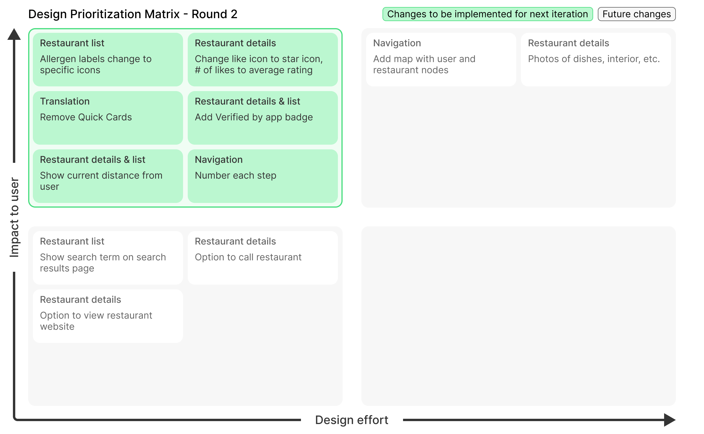
After some additional changes that were prioritized with a design prioritization matrix, I was ready for a second round of usability testing to validate my new changes.
Test, Test, Test Again
I was able to validate that the changes I made for V2 were successful because testers in this round did not have any feedback for the major areas of concern from round 1. That is not to say my design was perfect as testers still provided feedback for other things.
👍
Highlights
The Begin Translation CTA was iterated upon and no negative feedback was received in round 2 indicating my change has the desired effect
Copy updates help clarify actions and their context
'Verified by app' badge on restaurants is great feedback that would help boost confidence of travelers
🛠️
Room for Improvement
Testers have expressed over two rounds to have distance from user to restaurant to provide context
Ratings versus reviews and the implied meaning of the associated iconography
Testers could not visualize the expected outcome of interacting with Quick Cards
6Prototype
High-fidelity Mock-up
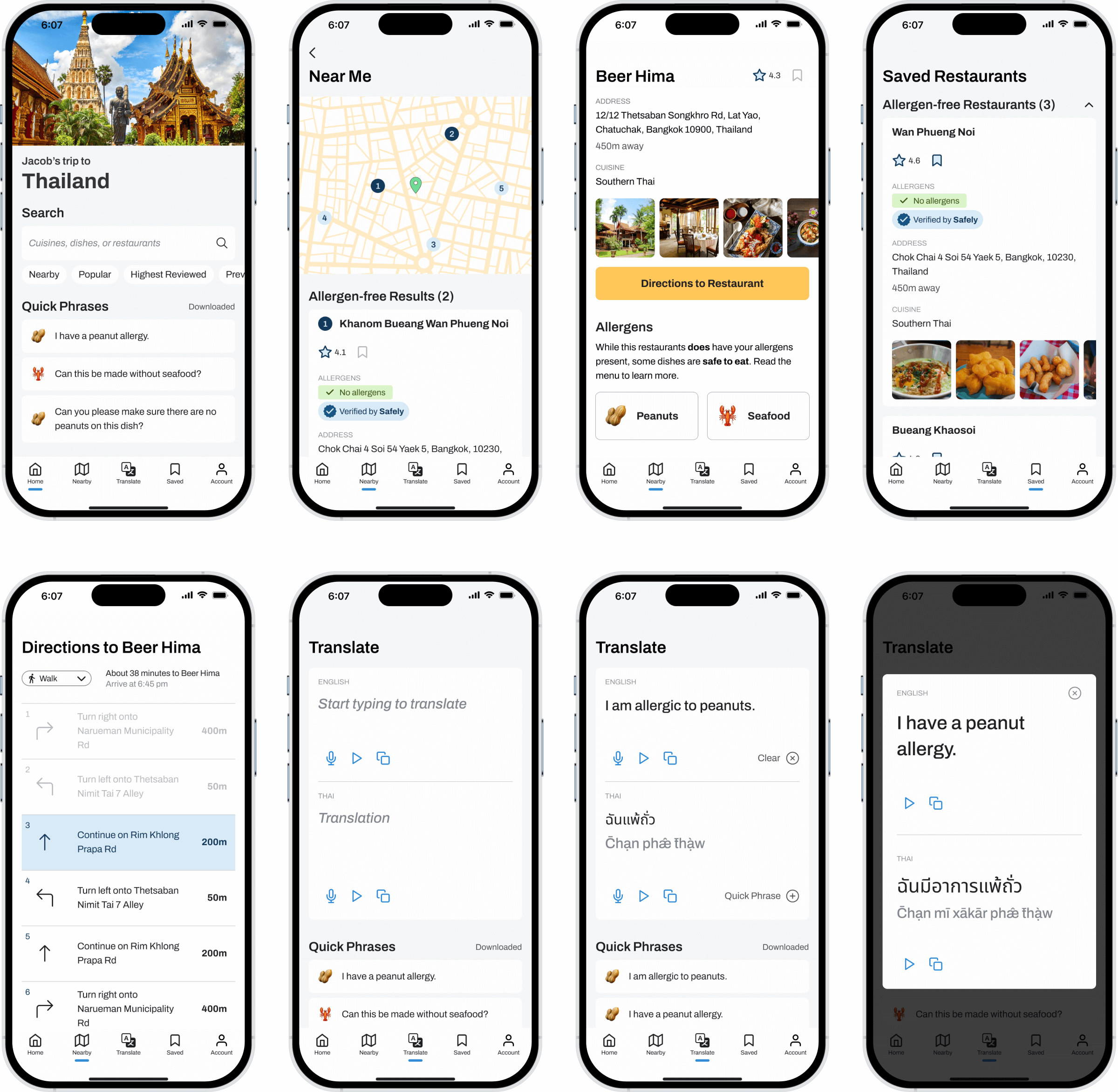
After two rounds of user testing, I was confident that my design solution was closely aligned to solving the initial problem I set out to solve for and so I was ready to commit to the design by implenting branding, personality, colour, imagery, and animations.
Features of my Solution
Search for restaurants
Find restaurants near you and see restaurants sorted by their allergens. The app will always provide safe options first.
View a restaurant's menu
When choosing a restaurant that isn't allergen-free, be reminded of present allergens and see safe options to eat.
Communicate your allergies
Type a phrase to translate it and add it to a list of Quick Phrases that are conveniently saved.
V3 Iteration, Getting Closer
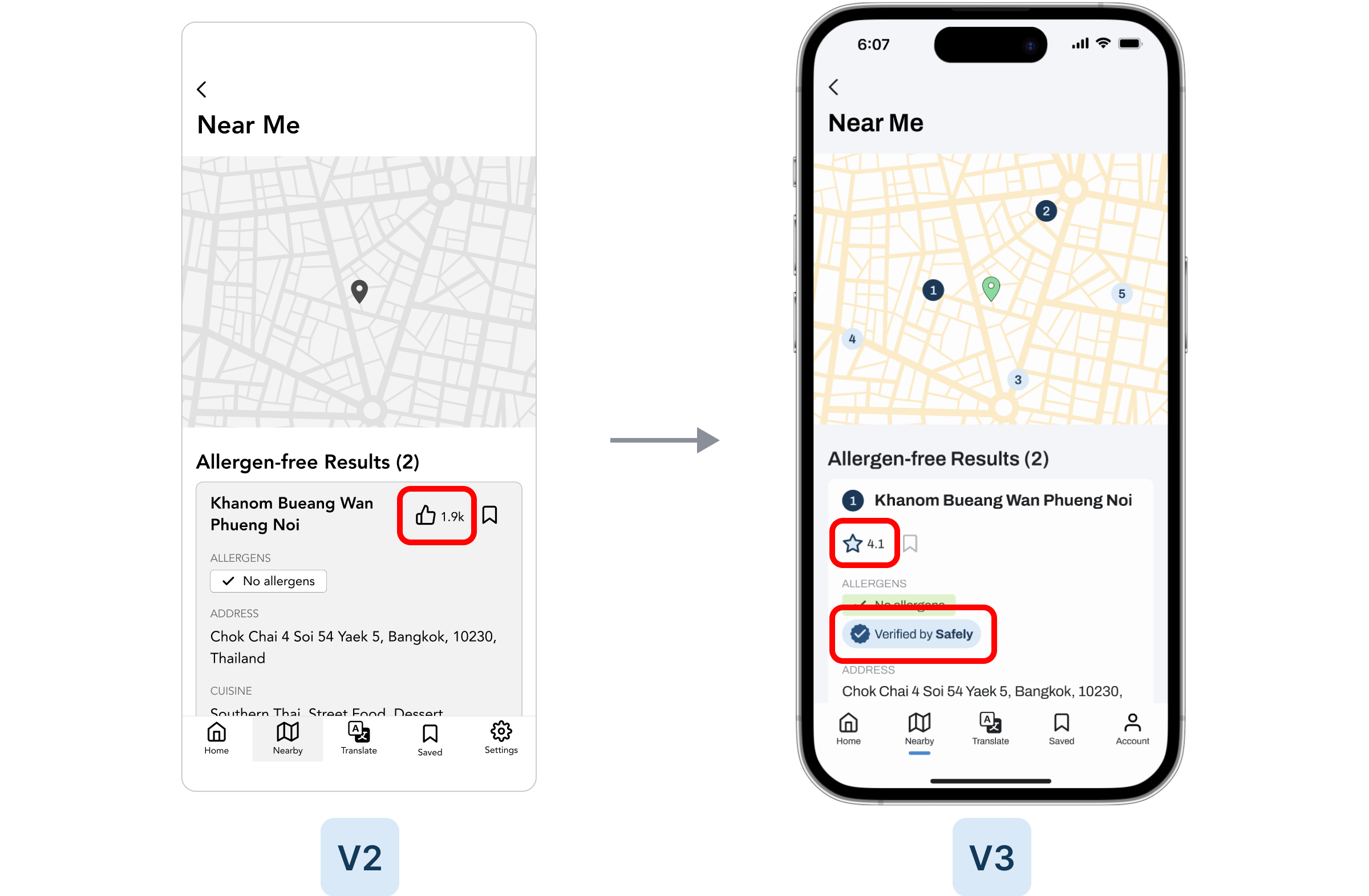
A few changes that were made for the high-fidelity mock-up include changing the thumbs up icon to a star icon. The original intention was that other travelers would give a restaurant their approval by tapping the thumbs up. However, during user testing it was revealed that testers felt that this system of rating wasn't as trustworthy or as valuable as a star rating. Testers felt that a star rating (assuming a scale of 0-5) provided a more accurate reflection of the traveler's experience with that restaurant.
Speaking of trustworthiness, another valuable insight gleaned from the second round of user testing was showing a badge that the app has verified certain restaurants to be safe. Some testers would believe the word of the app much more than the word of a restaurant so to see that the app has verified a restaurant afforded a high level of trust.
Changes other than the two mentioned above that were deemed to be high impact and low effort were also implemented based on this design prioritization matrix.
7Branding
Colors
Color Contrast Accessibility
8Supporting Materials
Scaling for new Experiences
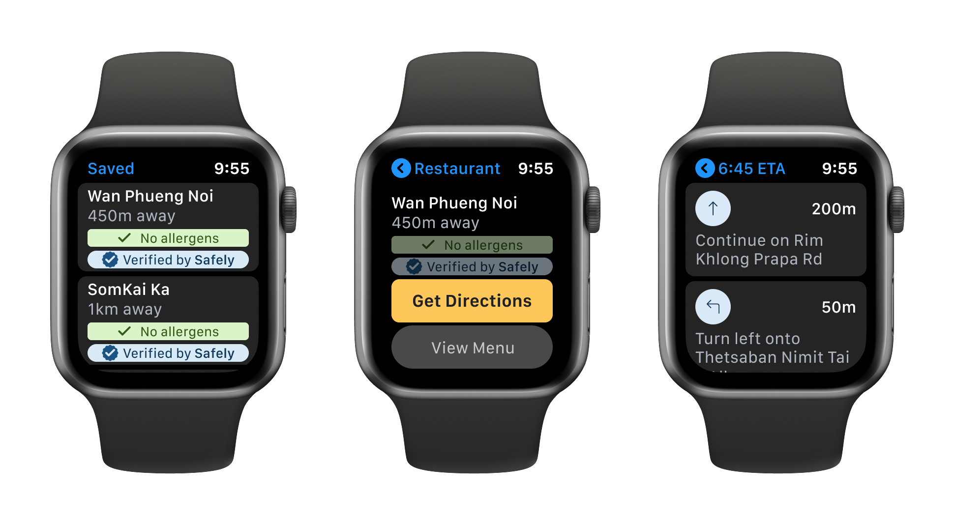
As proof of concept, I designed an experience for an additional device. The nature of Safely as a tool while traveling naturally lends itself to being used on mobile devices, as opposed to desktops or tablets. With that in mind I thought of other screens and devices where a user would likely be using the app.
Smartwatches came to mind as someone on the go might want to find directions to a restaurant. I created an abbreviated version of my original flow where users could view their saved restaurants and get directions to that restaurant.

9Project Outcomes
Verified Outcomes
96%
Task completion rate
92%
Unconditional task completion rate
10/10
Testers would use this solution on a trip abroad
How else would success be measured?
Key Performance Indicators
Monthly app downloads
App usage follow-through: the % of users who have downloaded the app and have used it on a trip abroad
Rate of restaurants signing up for service or requesting verification
Key Learnings
📝
Preparing a strong user interview script
I believe the quality of the interview script as well as the interviewer's ability to go off-script and probe in certain areas with respondents will lead to greater insights that will affect the entire project going forward.
🔎
Research the problem before designing a solution
It can be easy to get carried away and design a solution early in the process but without truly understanding users who are affected by this problem space, a solution at this point is not truly solving the problem.
🧑💻
The importance of user testing
Despite following the design process to inform a solution that I believe would best satisfy the needs of my users, user testing always reveals insights and validates or invalidates assumptions I have about my design decisions.
🗑️
Don't get attached to designs
Features that I envisioned would provide the most value ended up not being features that testers cared much for.
Next Steps
The solution that has been designed is only one task flow that encompasses one epic of user stories that I have authored. My chosen epic serves to create a MVP but there are more features and functionality that I would like to implement in the future.
The social aspect is one that I think would add value. Being able to share and read other travelers' experiences who share the same allergies would instill even more confidence in the user that positively affects their decision-making. The user would be able to create a list of the restaurants they visited over the duration of a trip and share that list with other travelers. I believe sharing these experiences helps to create a safer and more confident community of would-be travelers.
Future Thinking
What happens when 100 million people use your product?
A large user-base creates a robust database of restaurants that are safe to eat at. The result of more users contributing their personal experiences is an app and solution that can be trusted even more.
Who or what disappears if your product is successful?
The number of travelers with food allergies is not large enough to put restaurants containing food allergens out of business so that is not a worry. Overall I don't think the restaurant dynamic shifts too much. Restaurant-finding services such as Google Maps or Yelp who are not particularly serving the needs of travelers with food allergies might lose users due to not placing an emphasis on this use-case.
When you picture your user base, who is excluded? If they use your product, what would their experience be like?
Users without food allergies would choose restaurants based on other criteria that become similar to how the current experience of restaurant-finding is. Users would place an emphasis on distance, rating, and may look for a particular dish in the menu. While these are factors for the target user base, the aspect of not being concerned about food allergies creates a very different experience.

