1Introduction
The Project
Documenting and maintaining a design system for my case studies. Design systems are a specific area of interest and something I want to continue to grow in.
Detail, documentation, organization, clarity, communication - these are all things I think design systems should strive to excel in and so this miniature design system is my attempt at doing so.
My Role
UX/UI Designer
Tools
Figma
2Size and Spacing
Grid Scale

Case studies use a 4px grid scale with a base font size of 16px.
Units of Measure
| REM | Pixel |
|---|---|
| 0.25 | 4 |
| 0.5 | 8 |
| 0.75 | 12 |
| 1 | 16 |
| 1.25 | 20 |
| 1.5 | 24 |
| 1.75 | 28 |
| 2 | 32 |
REM is the default unit with 1rem equalling the base font size of 16px.
A base increment/decrement is 0.25rem, for example 1.25rem, 1.5rem, 0.75rem, 0.5rem. If we consider this to be 1 increment or 1 decrement, then half-increments or half-decrements can be used but should be used sparingly.
A half-increment is 0.125rem (0.25rem / 2). For example, 0.125rem, 0.875rem.
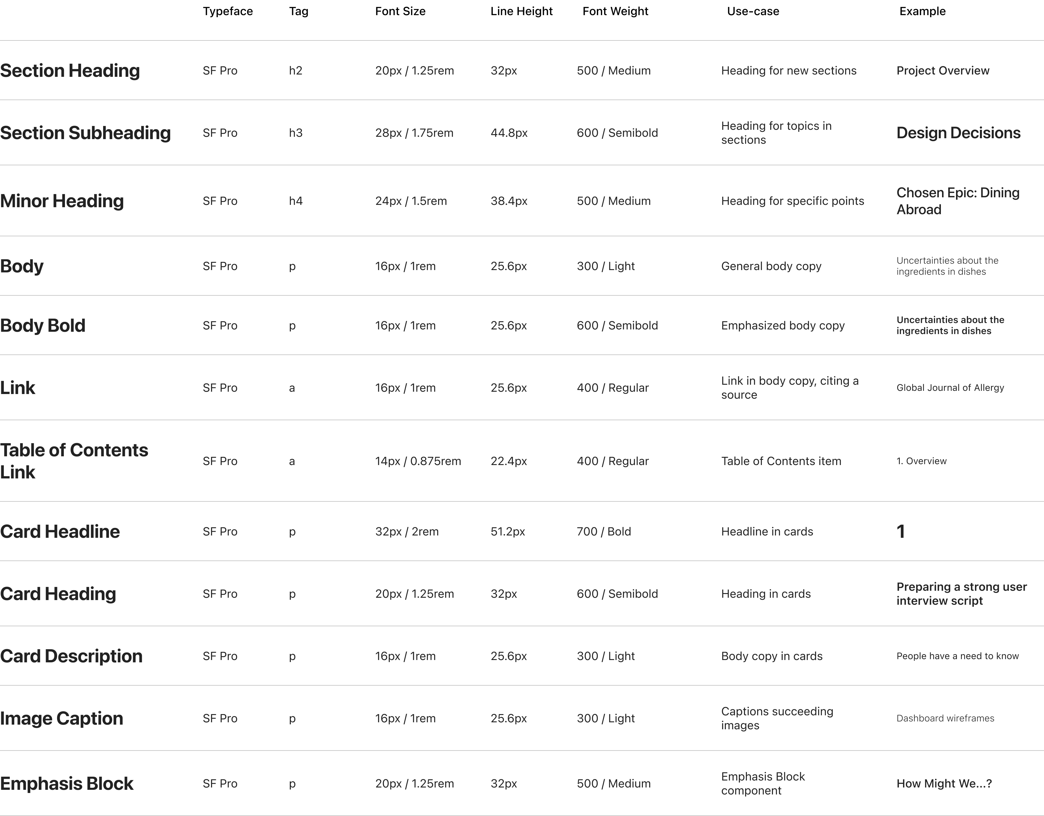
3Typographic Scale
4Layout and Wrappers
Desktop Layout
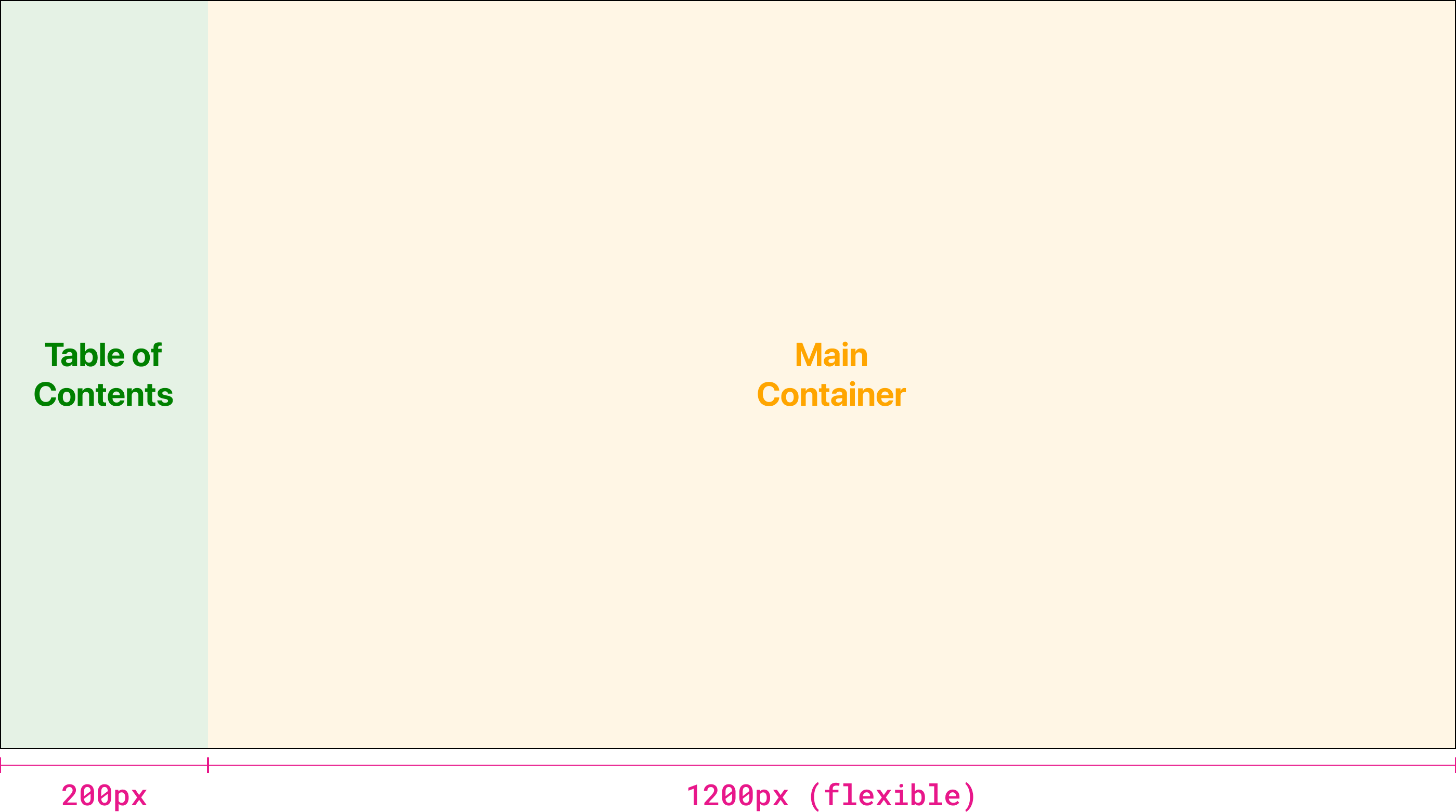
display: grid;
grid-template-columns: 200px 1fr;
Case study pages are broken into two sections, the Table of Contents and the Main Container. The Table of Contents is a fixed 200px in width, while the Main Container uses the remaining free space (1fr). The value of the width of the Main Container is not so important.
height: 100dvh;
overflow: scroll;
The Main Container has a fixed height of 100dvh, or dynamic viewport units. This allows the Main Container to be 100% of the viewport, and all additional content can be accessed by scrolling. This also allows the Table of Contents to remain fixed, giving users the ability to use the Table of Contents at any time.
Tablet Layout
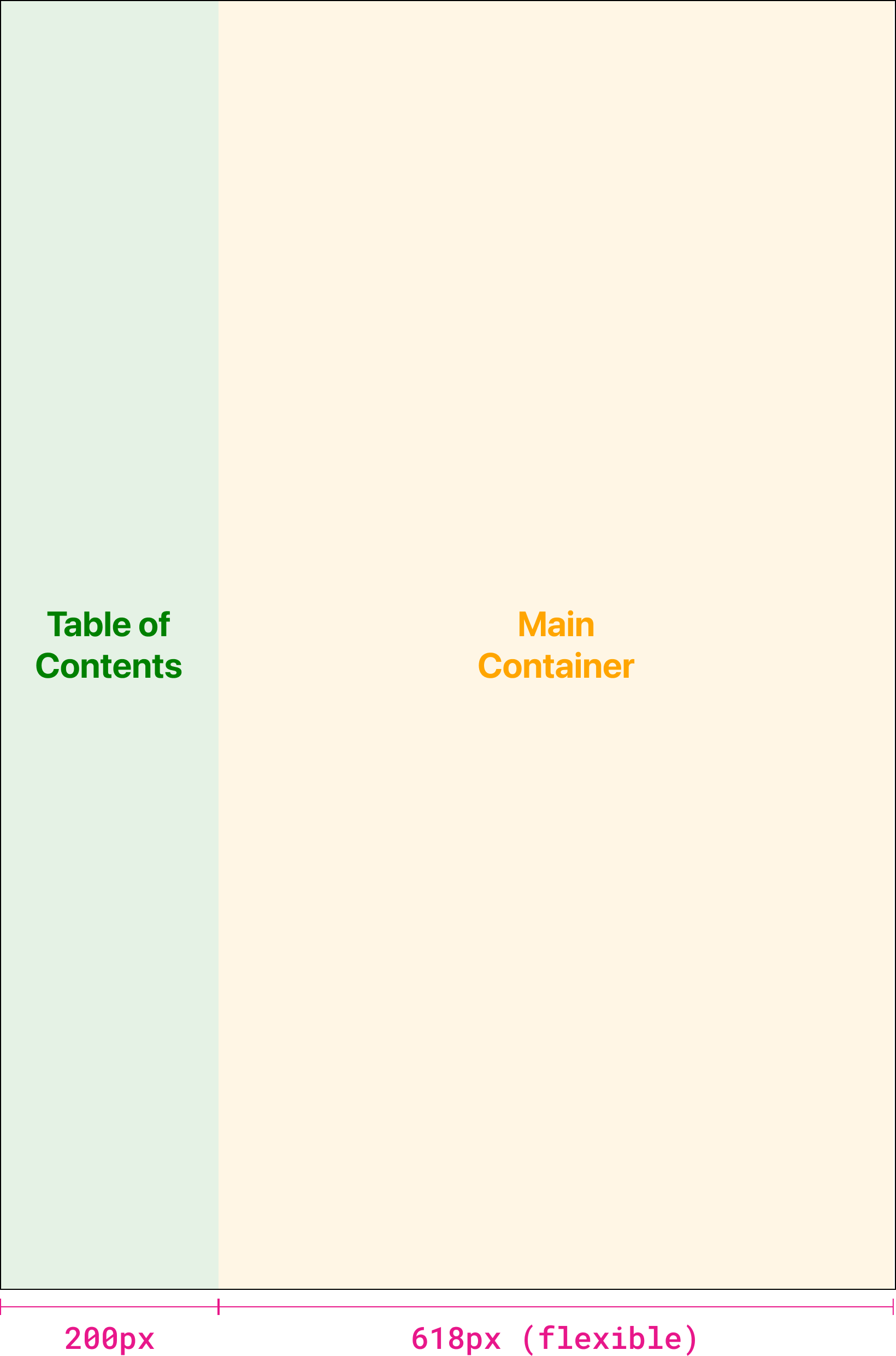
display: grid;
grid-template-columns: 200px 1fr;
This behaviour remains the same on tablets.
Mobile Layout
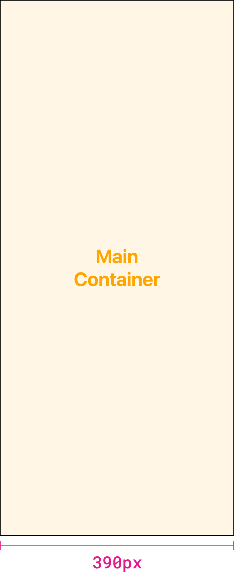
// Table of Contents
display: none;
// Main Container
grid-column: 1 / 3;
On mobile the Table of Contents is removed entirely, allowing the Main Container to be the entire width of the viewport.
Desktop Wrapper
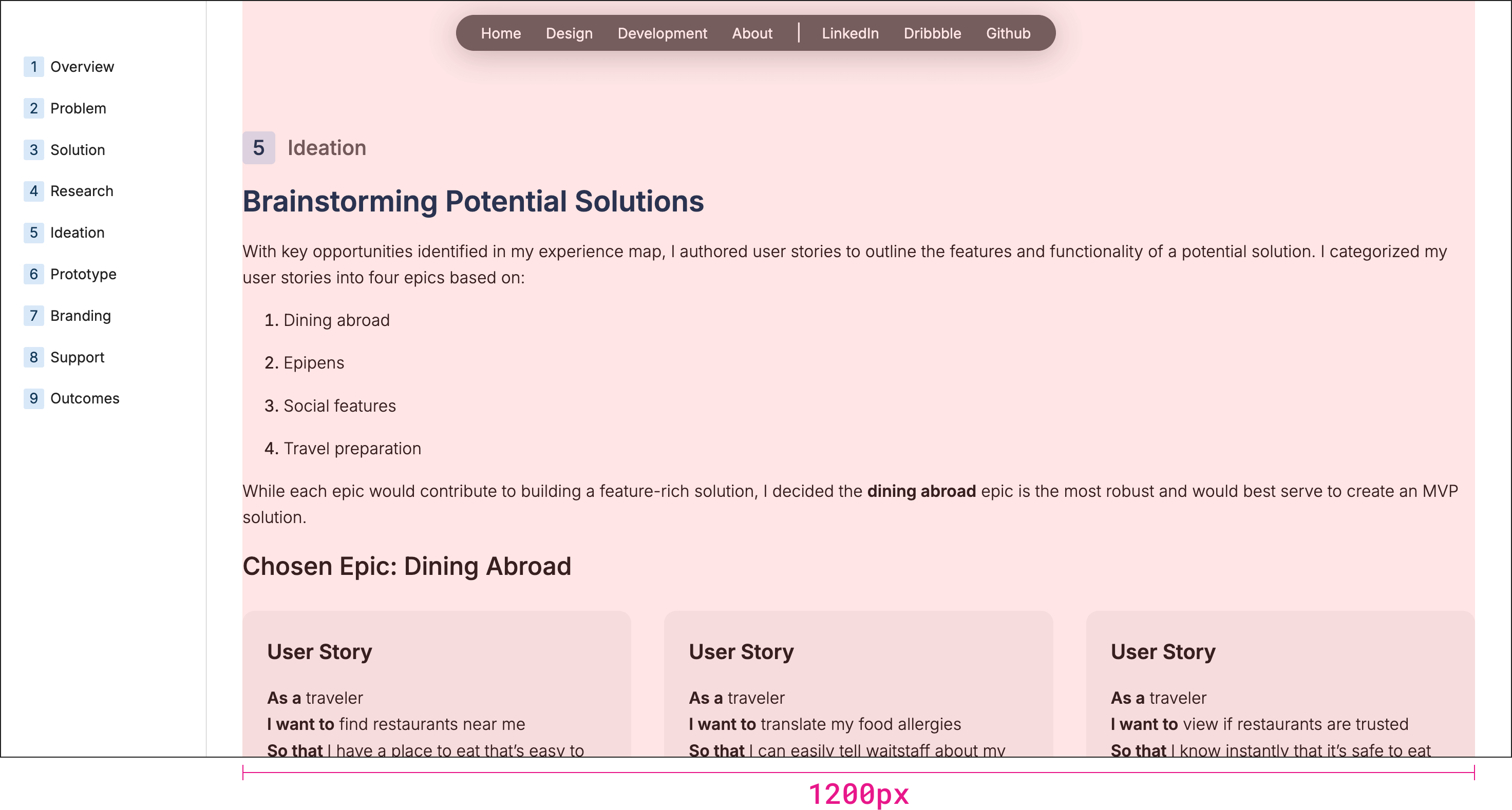
max-width: 1200px;
width: calc(100% - 4rem);
margin: 0 auto;
On desktop devices the wrapper has a maximum width of 1200px. This means that content can never expand past 1200px in width regardless of how large a screen may be. There are a few exceptions to this rule and those are mainly site layout components. The only relevant component is the hero banner used for case studies. This component will be edge-to-edge of the screen with no regard for the 1200px maximum width.
As devices shrink in size to screens less than 1200px wide, this value changes to 100% of the screen’s width minus 2rem (32px) on each side. The wrapper always centers the content.
Tablet Wrapper
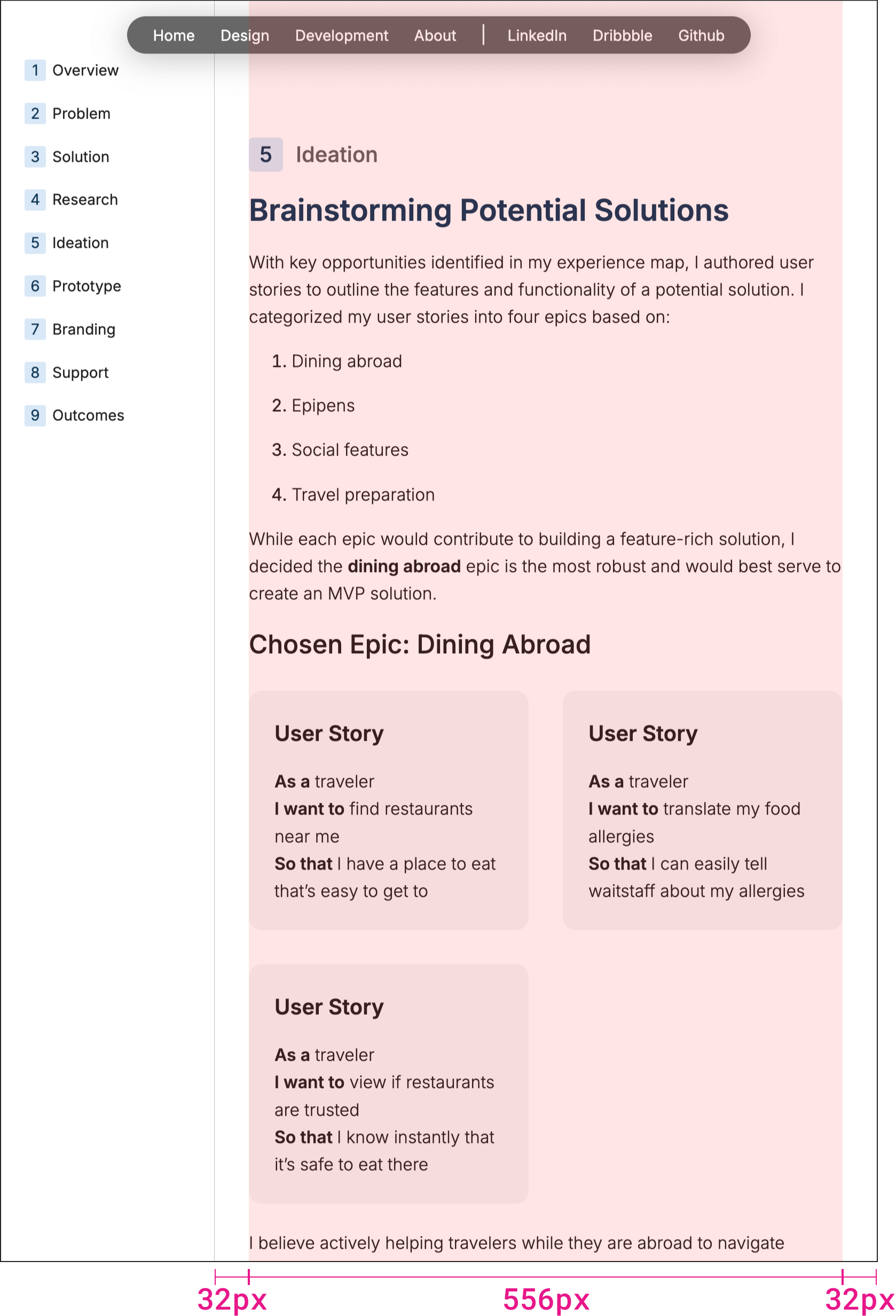
width: calc(100% - 4rem);
margin: 0 auto;
On tablets, the maximum width of 1200px is no longer being considered.
In this example, the wrapper is 556px wide but this value is not important. What’s important is the 32px (2rem) on either side - to add up to 48px (4rem) in total to give the wrapper and content margin on either side.
Mobile Wrapper
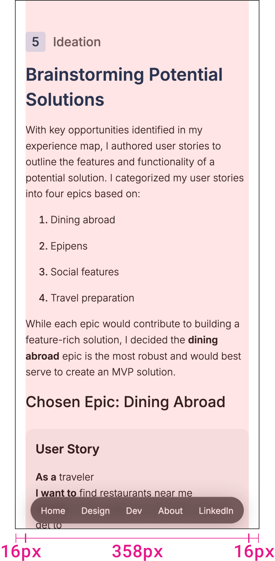
width: calc(100% - 2rem);
margin: 0 auto;
The wrapper’s behaviour is similar to that of tablets. However, for mobile screens the wrapper takes up 100% of the screen’s width minus 16px (1rem) on either side to add up to 32px (2rem) in total.
5Grids
Grid Spacing
For case study pages most content is 100% in width to the full extent that the wrapper allows - 1200px. The bulk of any case study page consists of body copy and design artifacts, which are both full width.
However, there is a grid system that can be used in sections for cards and card-like content. Cards are short, digestible pieces of information that would mostly be text and not a visual artifact.
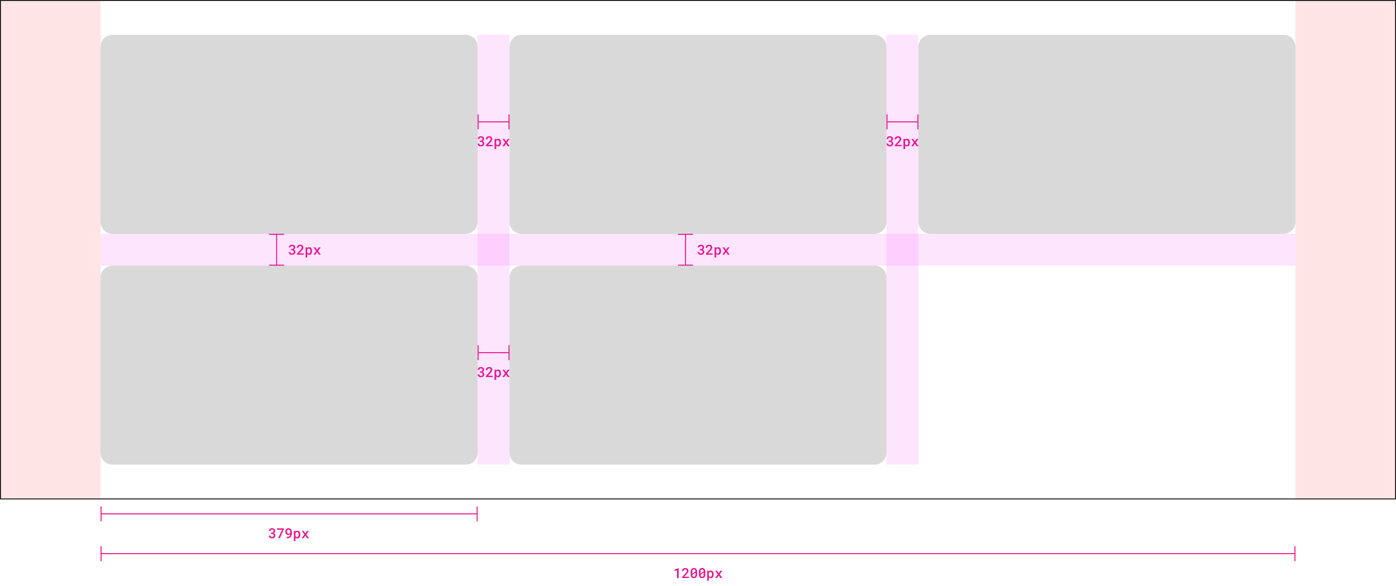
display: grid;
grid-template-columns: repeat(3, 1fr);
grid-gap: 2rem;
This is a 3-column grid. The width of a card in this case is approximately 379px when content is extended to the full 1200px on desktop. However that number is not so important as ensuring there is 2rem (32px) spacing (grid gap) for both columns and rows.
The truth is, 1200 - 32 - 32 = 1136 / 3 = 378.6666~ which isn’t a nice round number, but it’s okay! As long as the spacing between cards is a consistent 2rem, the width of cards themselves do not matter.
Now that I think about it, setting the wrapper to 1204px would result in even numbers but as I mentioned, the width of the card here is not so important as the consistent spacing between elements in the grid.
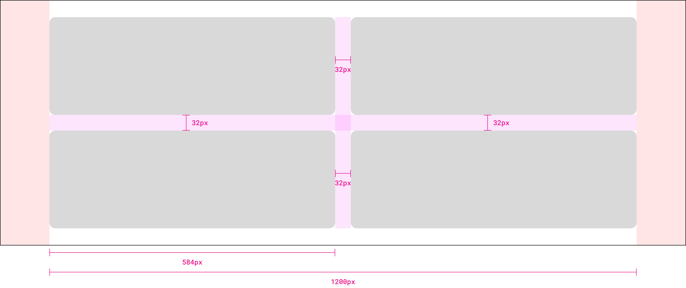
display: grid;
grid-template-columns: repeat(2, 1fr);
grid-gap: 2rem;
2-column variant. What determines whether a grid should be 3 columns or 2 columns depends on the amount of content in each card.
At the time of writing, there is no 4-column grid present on case study pages. There is no rule against it, but at that point the content in each card would have to be quite limited. In practice, 2-column and 3-column grids cover most use-cases.
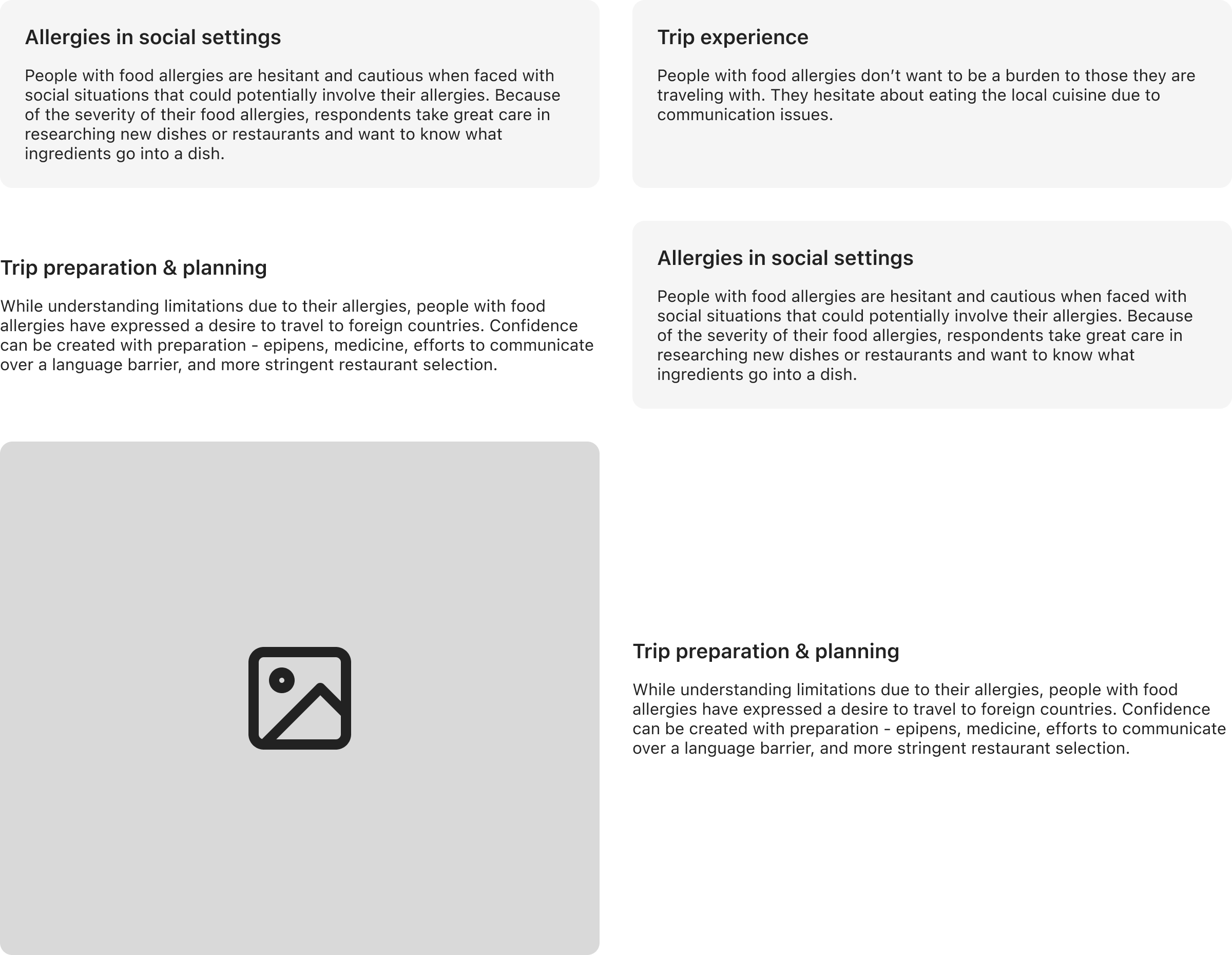
Grid Use-cases
The grid itself is concerned with layout. The contents of a grid can be flexible. Cards, text, images, and videos can all be placed in a grid.
Grid Responsiveness
Regardless of the number of columns a grid has, on tablets the grid should resize to 2 columns. On mobile devices, the grid should resize to 1 column.
Desktop

display: grid;
grid-template-columns: repeat(3, 1fr);
grid-gap: 2rem;
This is a 3-column grid on desktop. This example is showing how a 3-column grid responsively scales down. This is true for a 2-column grid, 4-column grid, or any other number of columns in a grid.
Tablet
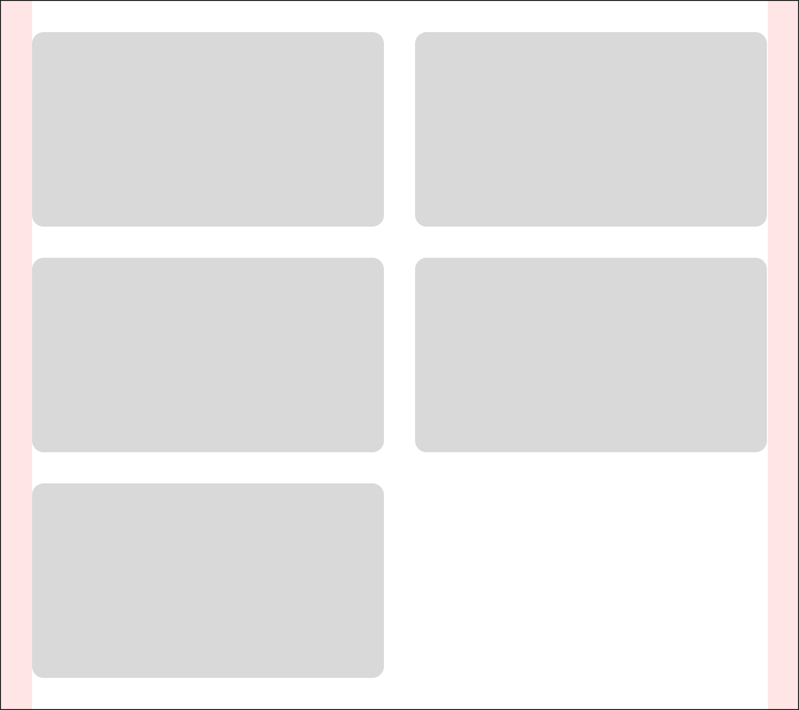
display: grid;
grid-template-columns: repeat(2, 1fr);
grid-gap: 2rem;
That same 3-column grid on desktop will resize to 2 columns on tablet.
Mobile
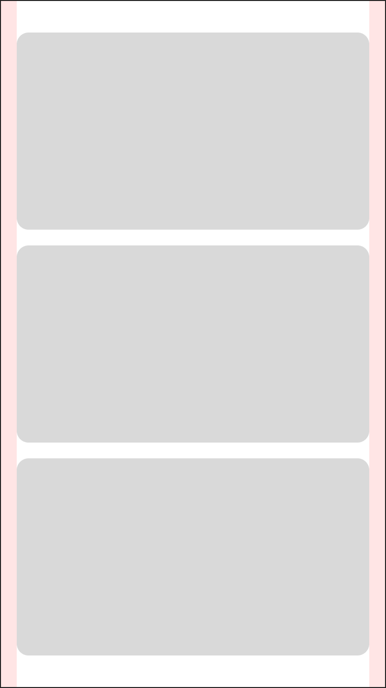
display: grid;
grid-template-columns: repeat(1, 1fr);
grid-gap: 1rem;
On mobile, the 3-column grid will resize to 1 column.
Note that the grid gap has also been reduced from 2rem to 1rem (16px) on mobile.
6Colors
Common Colors
Grey 50#F7F7F7
Grey 100#F5F5F5
Grey 200#E8E8E8
Grey 400#C0C0C0
Grey 800#919191
Grey 900#636363
Black#222
White#FFF
Semantic Success 100#D6F5E1
Semantic Success 900#6FDD97
Semantic Error 100#F5D7CC
Semantic Error 900#E15623
Safely Case Study Colors
Safely Brand Color 1#D9E9F7
Safely Brand Color 2#123959
Apple Music Case Study Colors
Apple Music Brand Color 1#F94C57
Apple Music Brand Color 2#FFF
7Components
Bordered Card

Spacing
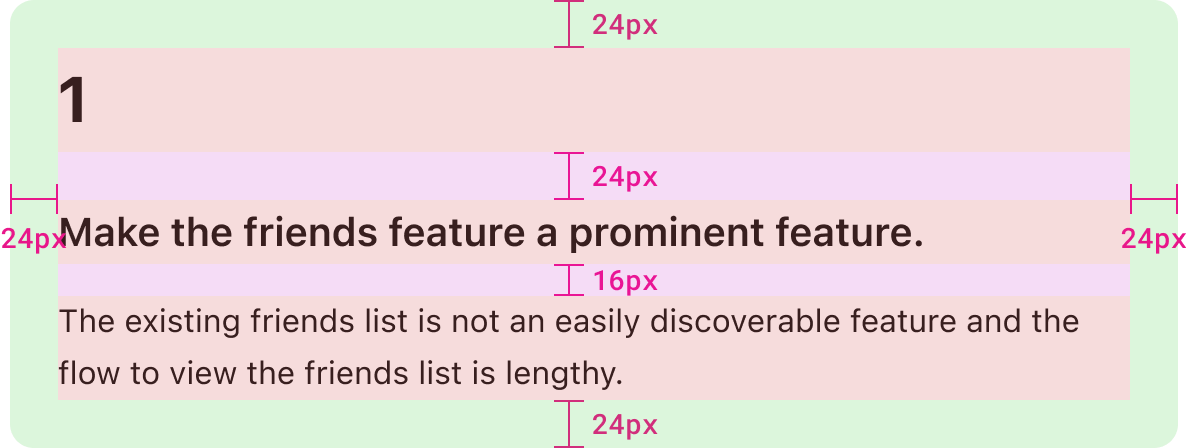
padding: 1.5rem;
background: ${grey100};
border-radius: 0.75rem;
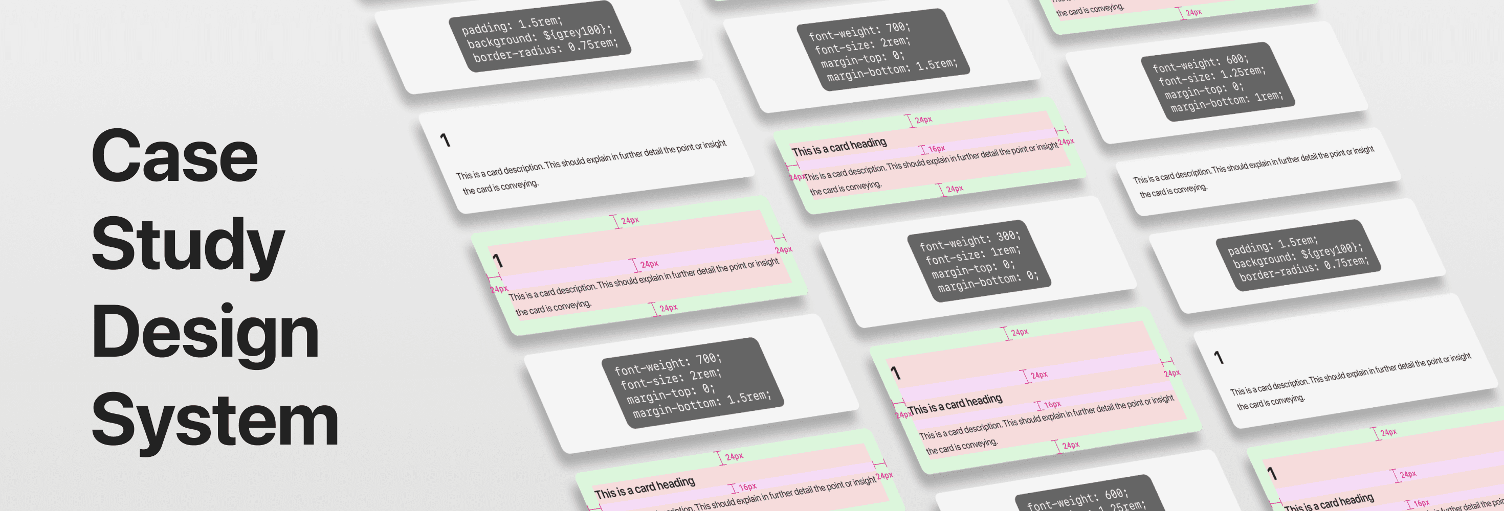
The Bordered Card has consistent padding around the component but the spacing (margin) between elements depends on the type of element (explained later).
Variations
1
The existing friends list is not an easily discoverable feature and the flow to view the friends list is lengthy.
Headline and description.
Make the friends feature a prominent feature.
The existing friends list is not an easily discoverable feature and the flow to view the friends list is lengthy.
Heading and description.
The existing friends list is not an easily discoverable feature and the flow to view the friends list is lengthy.
Description only.
Cards (both bordered and non-bordered) can have up to three elements: a headline, a heading, and a description. A card doesn’t need to have all three elements but each serve a different purpose.
Anatomy
Headline

font-weight: 700;
font-size: 2rem;
margin-top: 0;
margin-bottom: 1.5rem;
Headlines should be reserved for a few characters only. Big, punchy numbers or emojis to grab the reader’s attention.
Heading

font-weight: 600;
font-size: 1.25rem;
margin-top: 0;
margin-bottom: 1rem;
The heading should deliver the main insight of a card, unless that would be too long. Generally the heading should be kept to two lines or less.
Description

font-weight: 300;
font-size: 1rem;
margin-top: 0;
margin-bottom: 0;
The description can further explain the heading or in some cases be the sole content of a card. Additional context may be required.
Colors
1
Make the friends feature a prominent feature.
The existing friends list is not an easily discoverable feature and the flow to view the friends list is lengthy.
background: ${grey100};
The default background color of {grey100} is typically used.
1
Make the friends feature a prominent feature.
The existing friends list is not an easily discoverable feature and the flow to view the friends list is lengthy.
background: ${white};
The background color of the card can be set to {white} when used on non-white backgrounds.
Non-bordered Card

Spacing

padding: 0;
background: none;
border-radius: 0;
In relation to the Bordered Card, the Non-bordered Card removes the padding and border radius. The Non-bordered Card maintains the same spacing between elements in the card as the Bordered Card.
Variations
1
The existing friends list is not an easily discoverable feature and the flow to view the friends list is lengthy.
Headline and description.
Make the friends feature a prominent feature.
The existing friends list is not an easily discoverable feature and the flow to view the friends list is lengthy.
Heading and description.
The existing friends list is not an easily discoverable feature and the flow to view the friends list is lengthy.
Description only.
Section Numbers
1
2
3
4
5
6
7
8
9
display: flex;
justify-content: center;
align-items: center;
width: 2rem;
height: 2rem;
border-radius: 0.25rem;
Character Properties and Length
1
2
3
4
5
6
7
8
9
10
11
12
13
14
15
16
17
18
19
20
111
222
333
444
555
666
777
888
999
font-size: 1.25rem;
font-weight: 500;
Text style: Section Heading (see typographic scale)
Because width and height is implicitly set to 32px this component will never grow or shrink. It will run into problems if the character length is too long. However given the limited use-case of numbering sections, we can reasonably presume there will not be any triple character instances.
Padding between the number and the border of the box is not relevant.
Colors
1
2
3
4
5
6
7
8
9
1
2
3
4
5
6
7
8
9
1
2
3
4
5
6
7
8
9
color: ${brandColor2};
background: ${brandColor1};

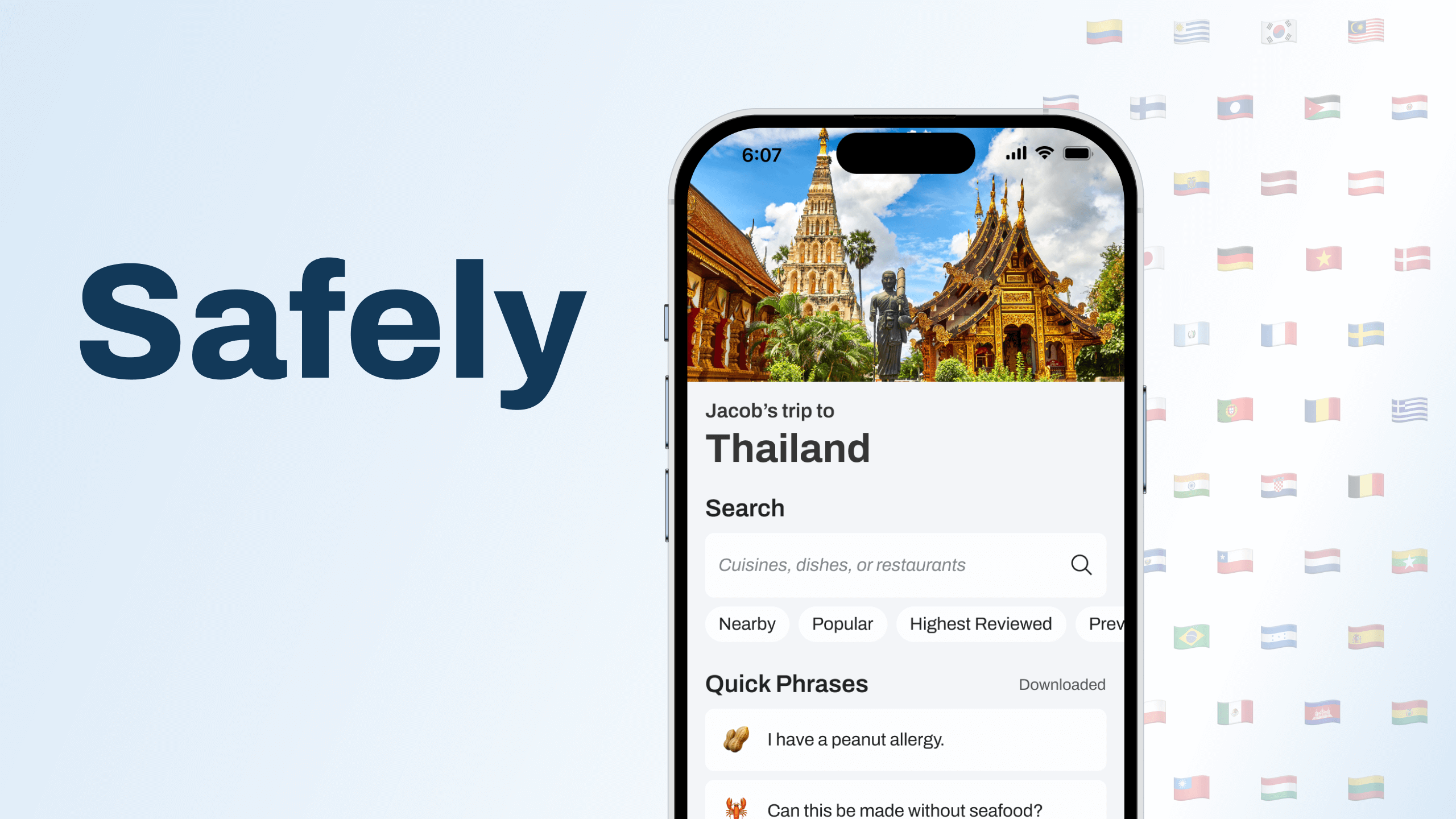
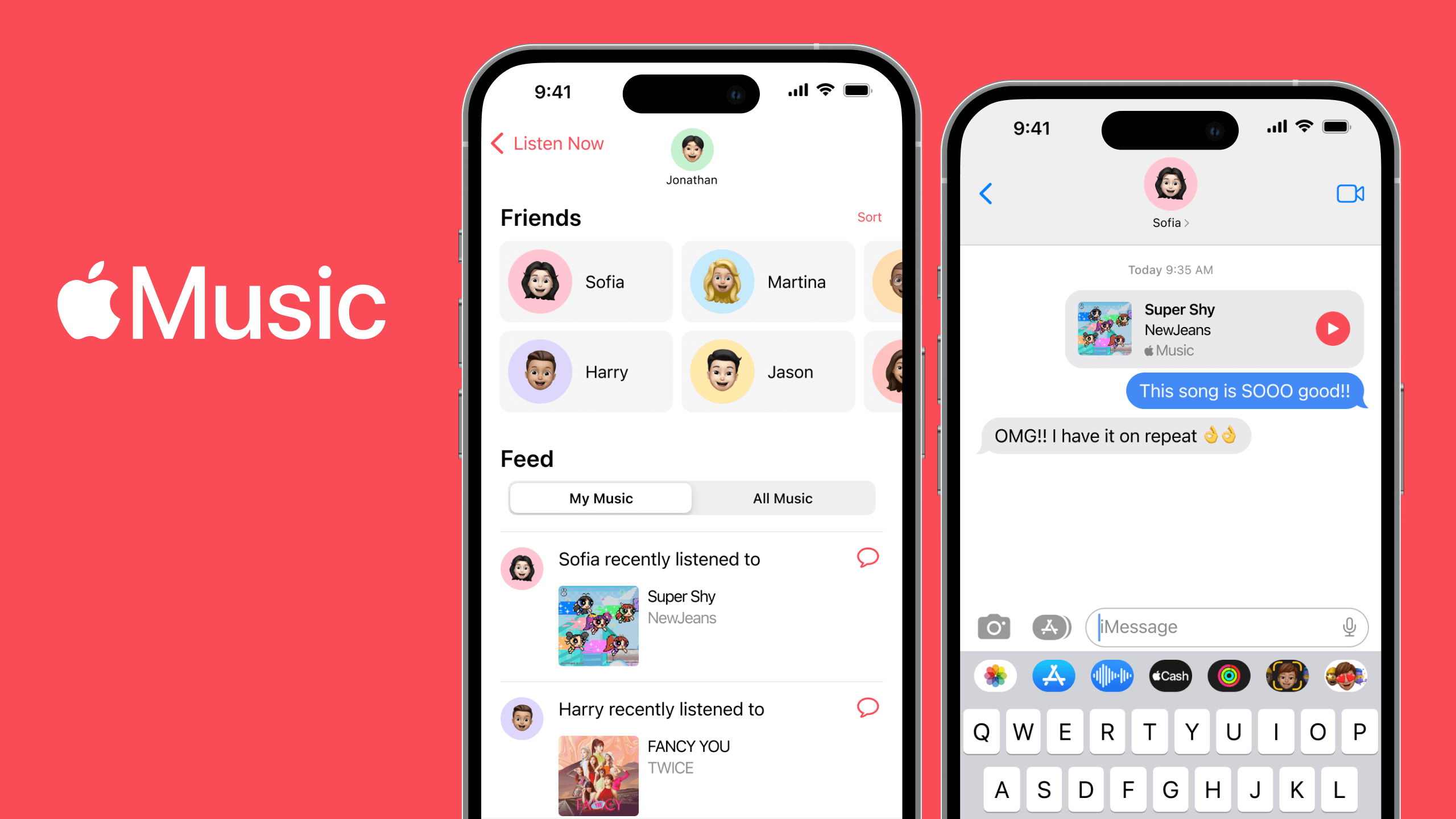
This component’s colours are dynamic, meaning the colour of the element and background colour will vary from case study to case study. Case study colours are determined in larger, global components and passed down to specific components such as this one.
Links
Inline Link
Default State

padding: 0.125rem 0.5rem;
border-radius: 0.25rem;
background: ${grey100};
Text style: Link (see typographic scale)
Hover State

transition:background 0.2s;
background: ${grey200};
// arrow
transform: rotate(-45deg);
Size and Spacing

padding: 0.125rem 0.5rem;
border-radius: 0.25rem;
The inline link should be used in body text, as opposed to a CTA link which would occupy its own line.
When hovered over, the arrow should rotate 45 degrees counter-clockwise and the background should transition from {grey100} to {grey200}. All animations should occur in 0.2s.
CTA Link
Default State

padding: 0.5rem 1rem;
border-radius: 3rem;
Text style: Link (see typographic scale)
Hover State

// arrow
transform: rotate(-45deg);
Size and Spacing

padding: 0.5rem 1rem;
border-radius: 3rem;
Colors

color: ${white};
background: ${brandColor1} || ${brandColor2};

Width
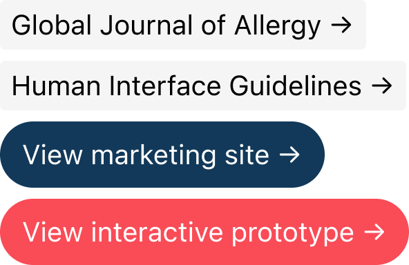
Width is not explicitly set on any of the link styles. Width is determined by the length of the content inside the link along with the padding that has been set.
Emphasis Block
Apple Music users that enjoy listening to music, discovering new music, and talking to their friends about music have the problem that they want to know what music their friends are listening to. My solution should deliver the ability for users to learn about their friends' music tastes and discuss with friends the music that they have in common.
padding: 2rem;
font-size: 1.25rem;
font-weight: 500;
Text style: Emphasis Block (see typographic scale)
The Emphasis Block is used to emphasize text on a case study page. This component should be used sparingly or else its value would be diminished with repeat use. The Emphasis Block can have multiple paragraphs but the length of text should be considered.
Size and Spacing

padding: 2rem;
The emphasis block is 100% in width, meaning the component will grow and shrink alongside the standard Wrapper. The component will have a maximum width of 1200px and shrink as necessary. The height of the component is dynamic in the sense that the number of lines of text plus top padding and bottom padding will determine the height.
Colors
Apple Music users that enjoy listening to music, discovering new music, and talking to their friends about music have the problem that they want to know what music their friends are listening to. My solution should deliver the ability for users to learn about their friends' music tastes and discuss with friends the music that they have in common.
I believe language barriers create skepticism or doubts in people with severe food allergies that prevent them from trusting the local cuisine while abroad.
I will know this to be true when the majority of my interview respondents acknowledge that language barriers have been a factor that have caused hesitation in choosing a travel destination.
color: ${brandColor2};
background: ${brandColor1};

Summary Card
The Project
Academic project for BrainStation's UX Design Diploma program. The problem space is concerning travelers with severe food allergies. These individuals face fear and anxiety when traveling abroad due to uncertainties regarding the local cuisine as it relates to their allergies.
This solution allows travelers with food allergies to travel abroad, experience new cultures, and navigate around local cuisines. This is an individual case study spanning the design process from problem discovery, definition, developing, and design iteration.
My Roles
UX Researcher
UX/UI Designer
Timeline
3 months
Tools
Figma
Figjam
InVision
// Card Heading
font-size: 1.25rem;
font-weight: 600;
margin-top: 0;
margin-bottom: 1rem;
// Card Description
font-size: 1rem;
font-weight: 300;
margin-top: 0;
margin-bottom: 0;
The Summary Card extends the design of the Bordered Card. It is modular and uses a grid to arrange different types of content within it. Text styles are the same as the Bordered Card, that is the Card Heading and Card Description.
Unlike Cards, the Summary Card should only ever be used at full width and not in a grid with other cards.
Size and Spacing
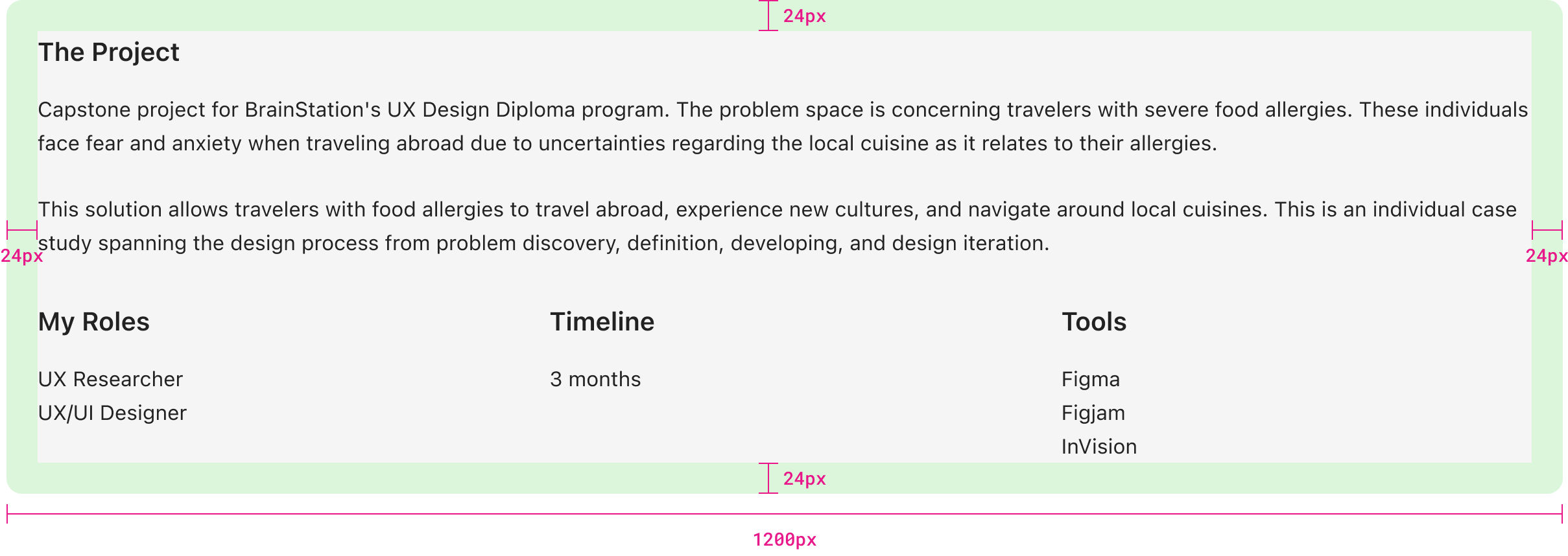
padding: 1.5rem;
background: ${grey100};
border-radius: 0.75rem;
Grid Spacing

display: grid;
grid-template-columns: repeat(3, 1fr);
grid-gap: 2rem;
A standard grid is used here. Current use-cases are 3-column grids but the case can be made for 4-column or even 5-column grids if the content isn’t too text-heavy.
Table of Contents
Default State

font-size: 0.875rem;
text-decoration: none;
// Number
color: ${brandColor2};
background: ${brandColor1};
// Text
color: ${black};
Text style: Table of Contents Link (see typographic scale)
Hover State

color: ${brandColor2};
background: ${brandColor1};
// Number
color: ${brandColor1};
background: ${brandColor2};

Size and Spacing
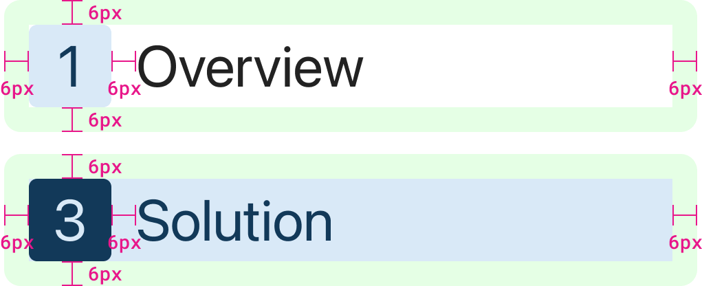
padding: 0.375rem;
gap: 0.375rem;
border-radius: 0.25rem;
Links have padding even in their default states. This ensures the size of the link is consistent in all states as only colours are changing.
Table of Contents List Spacing
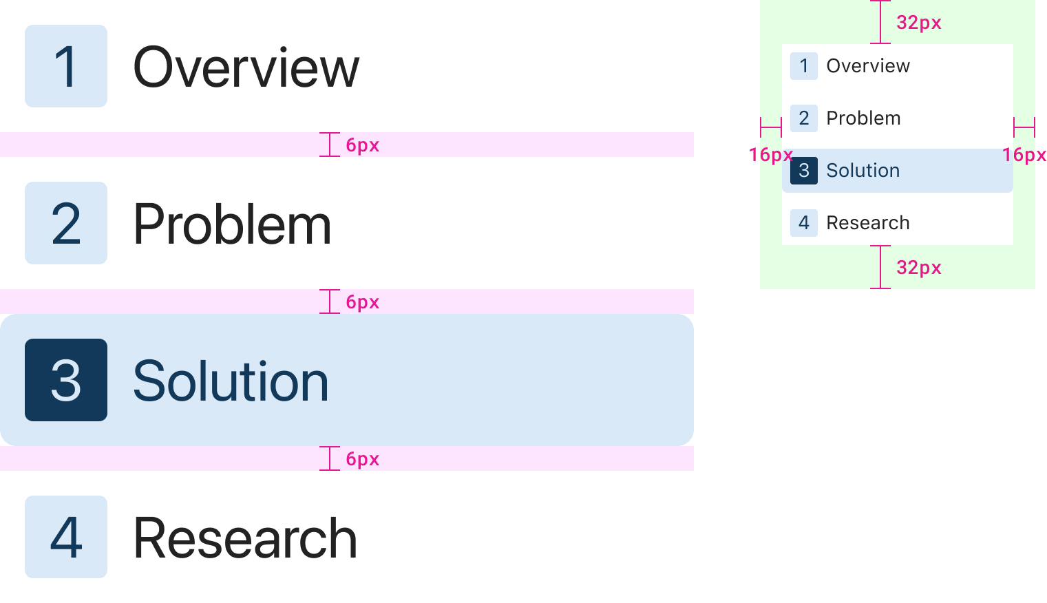
display: flex;
flex-direction: column;
gap: 0.5rem;
padding: 3rem 1rem;
The Tablet of Contents layout can be best achieved using Flexbox. In any case, there should be a 6px (0.375rem) gap consistently between links. This gap is in addition to the padding of each link.
